A company's philosophy and values are important and should be communicated both visually and in terms of content.
LuxConnect has been the most modern, flexible and creative facility provider and business enabler on the Luxembourg ICT market with its own infrastructure since its foundation in 2006. If services were to be presented at international and national events or during decisive customer acquisition in the B2B sector, an image brochure was lacking. That job of that brochure would be to underline LuxConnect’s professional image both visually and in terms of content. The communication of the company’s values and products, such as the provision of data centres, dark fibre and supplementary services, would be broken down and presented transparently in it.
Another important point for the company, laid down in the CSR report, is its ecological orientation. So the material of the brochure also played a decisive role.
Conceptual design combined with LuxConnect's existing corporate design
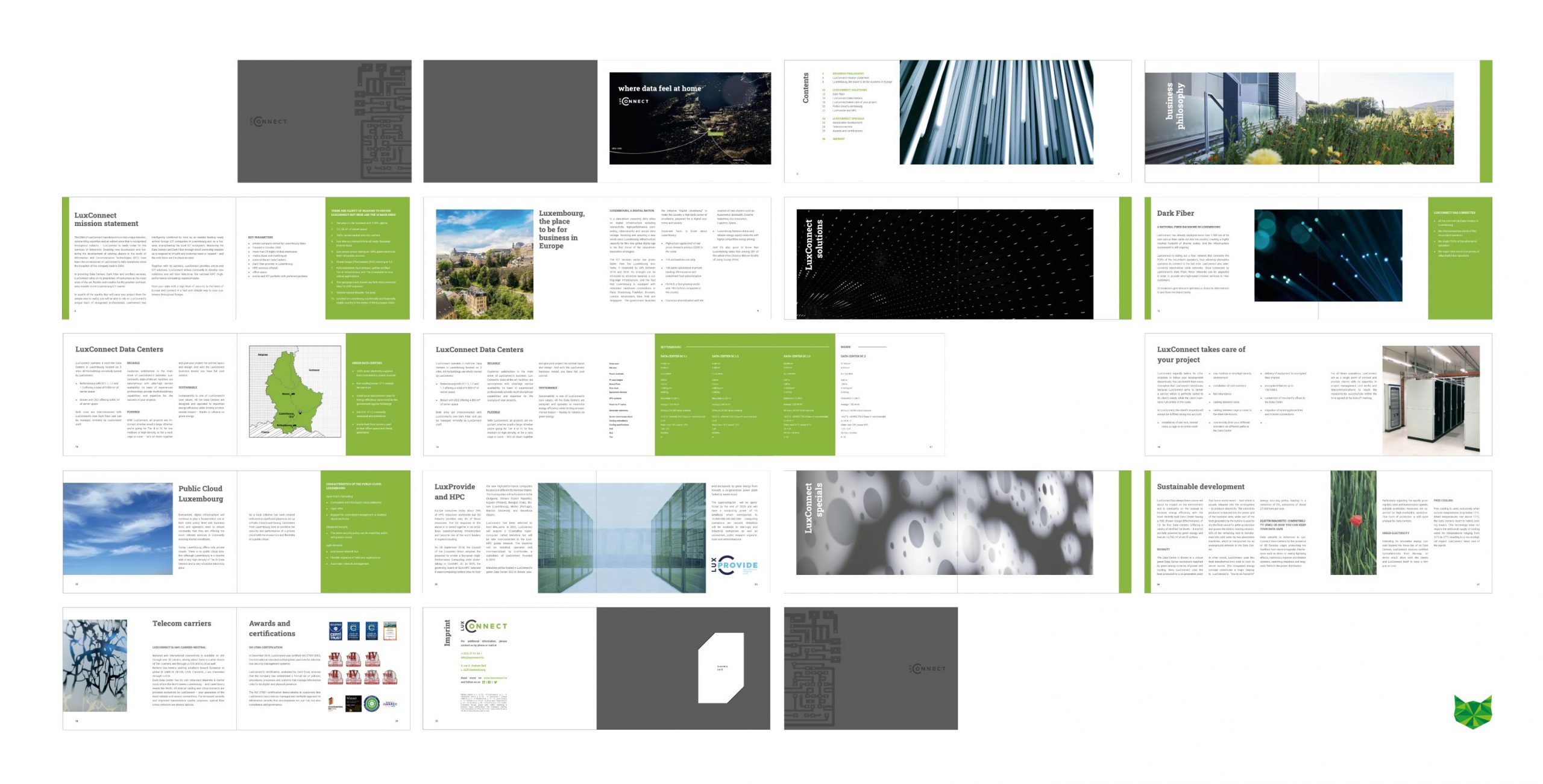
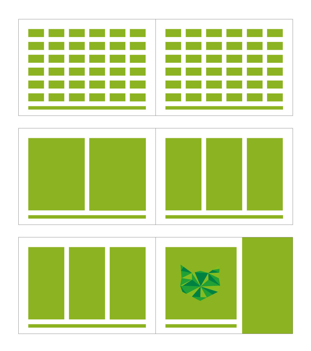
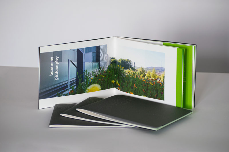
The visual appearance of the company is characterised, among other things, by the logo, which can be read from two angles – horizontal and vertical. This distinctive form is expressed in the format and in the placement of image and text, which in turn are structurally lived out in the grid and move in constant change on the individual pages. To create this flexible alternation, a grid of six columns and rows was created. Important information notes are available to the reader in the image brochure, summarised in a conspicuous green box.
Specific elements associated with LuxConnect’s values, such as artistic photographs – some of which were created in joint projects with students – or striking graphics of buildings, round off the concept, reflecting the company’s modernity and flexibility.
Always in view: LuxConnect’s corporate design, which enables a uniform style through the colours and typography.
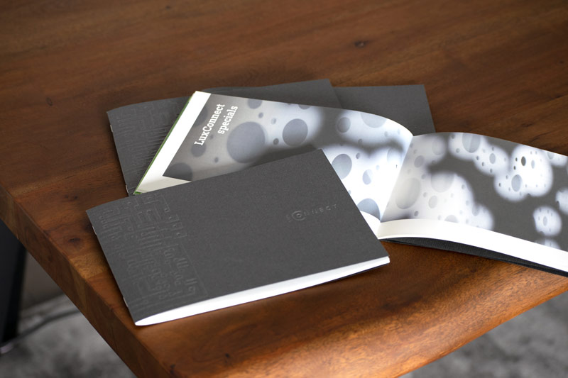
The impression of the company should already be conveyed through the haptics
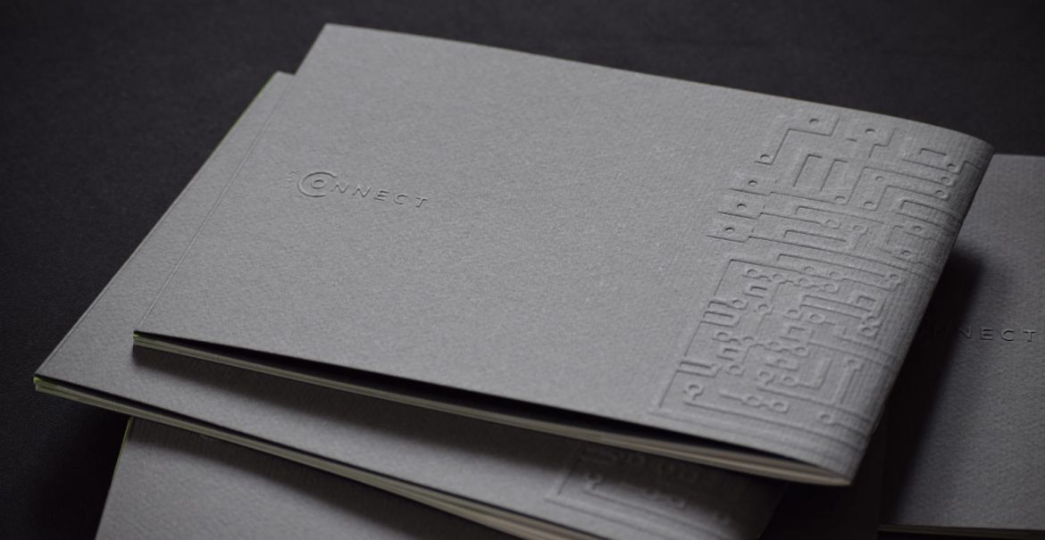
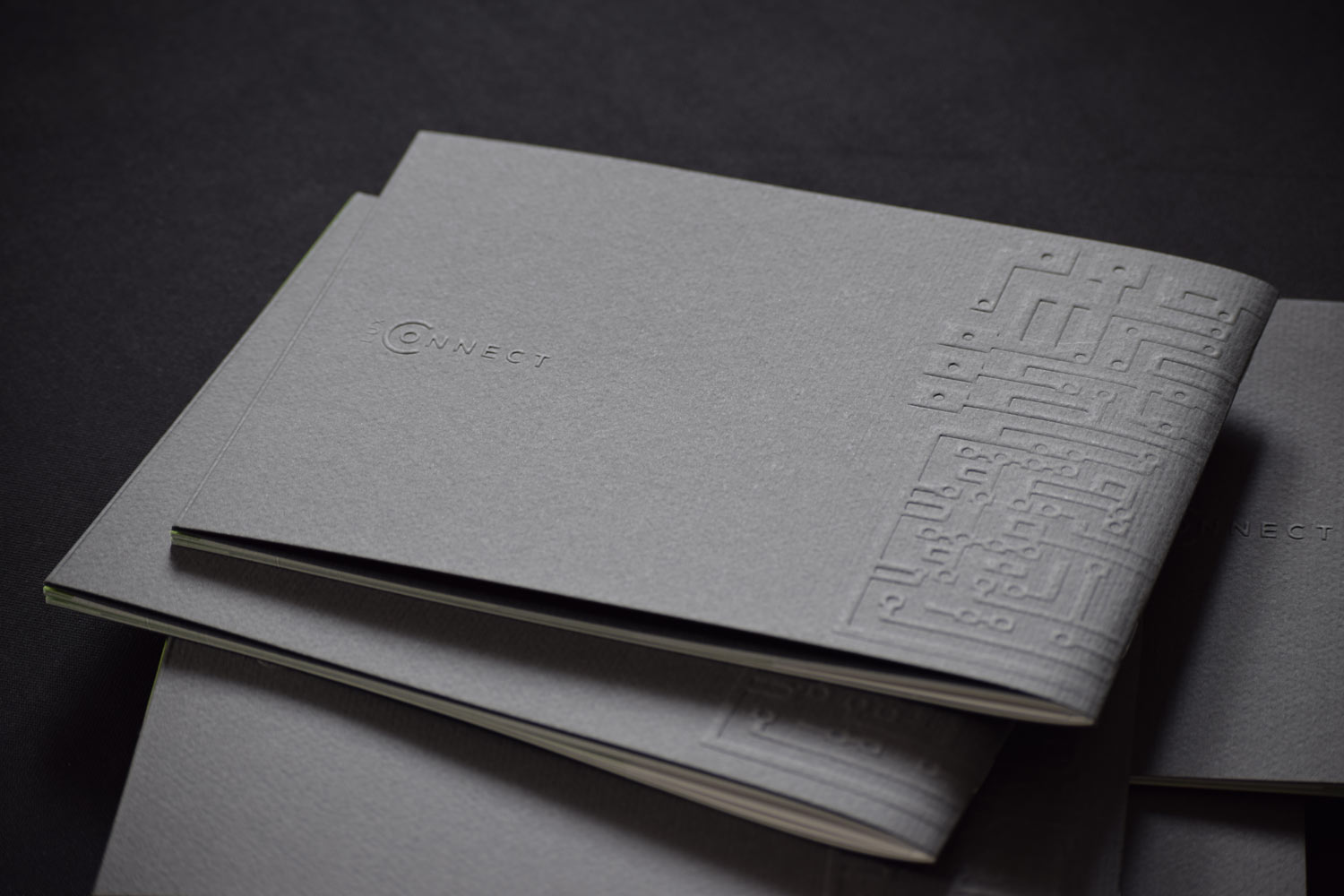
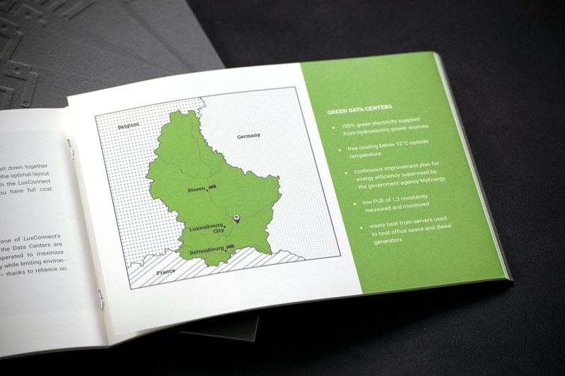
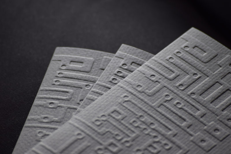
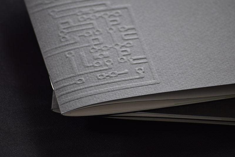
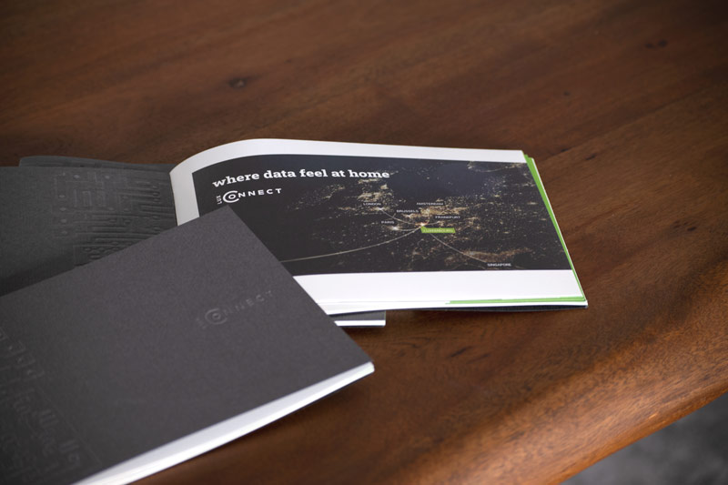
The image brochure stands out from ordinary and everyday company brochures, especially compared with those of competitors, among other things in the feel of the material. Taking sustainable materials into account, specially selected paper grades and gentle finishes such as embossing were used. The spine of the brochure is held together by a simple staple binding.
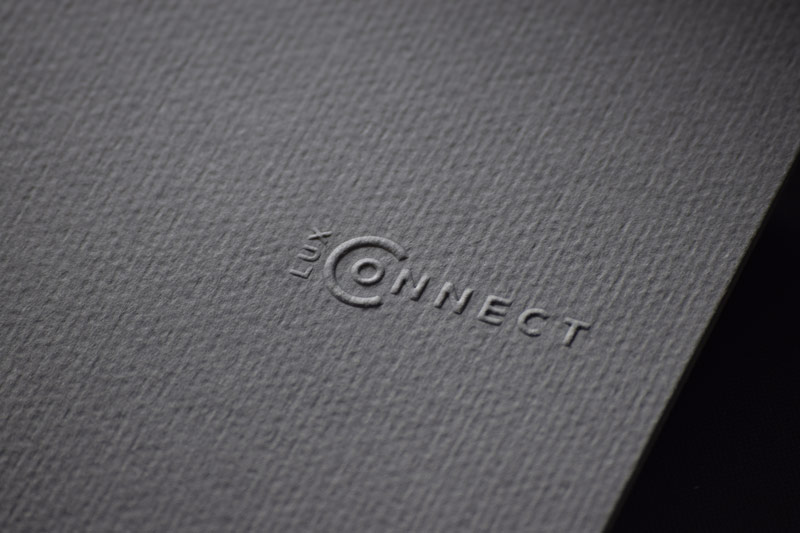
The noble and serious design is thus already conveyed through the fingers and gives the reader a first feeling about the company and its values. Unobtrusively and discreetly, the logo is staged with a technically recognisable graphic.
The cover has a folded compartment on the back for a business card, which is clamped in by simple slots. In this way, the customer receives a personal contact at the end with the information collected about the company.
Planning
Design
Realisation
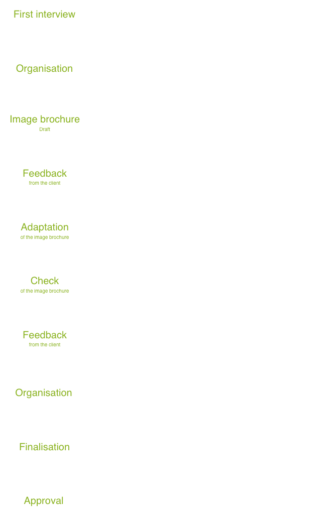
The project image brochure for LuxConnect was implemented in a structured and successful way through the scheduled project plan and the regular joint meetings.
