Is a logo just a logo? The interpretation of phase grün
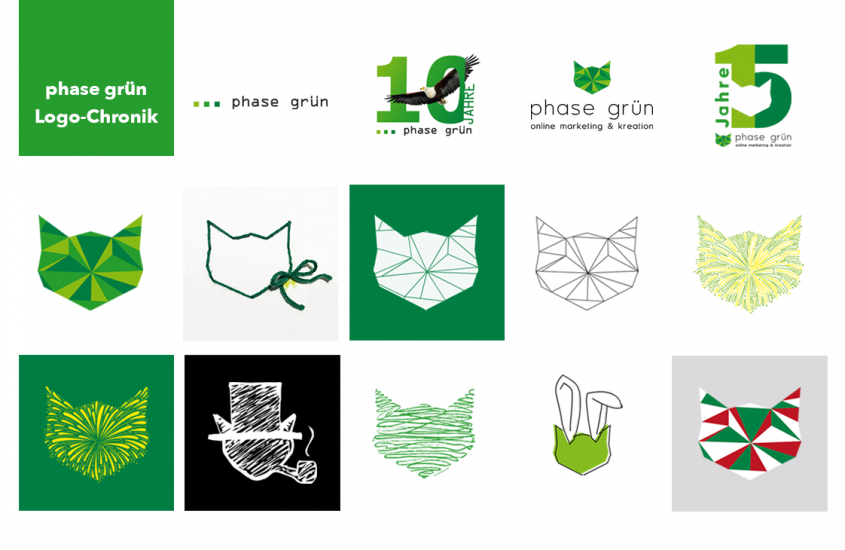
A logo, either picture or type-based, is a visual component of the branding of products. The advantage of picture logos is the better memory effect. Logos should be designed in such a way that they activate, are easily perceived and remembered.
Source : Gabler Wirtschaftslexikon
With this in mind, we analysed our previous logo and came to the conclusion that we needed a new logo for the agency’s 10th anniversary. But as is always the case, logo development is not a simple matter. So we started with a special 10-year logo.
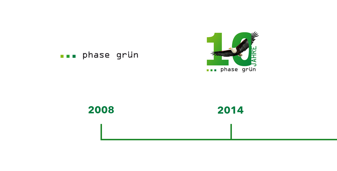
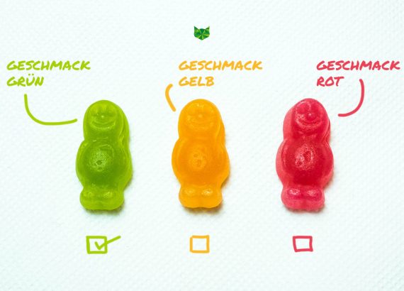
Over the next few years, we continued to work on the topic of the logo. What should the new one do better than the previous one? The three shades of green should definitely stay, as they stand for the basic idea – to bring our clients into the green area. Analogous to the traffic light from red to yellow to green, i.e. from light to dark green. However, the three small squares were not really emotional or memorable. So we needed something new, something emotional with an unmistakable recognition effect, no matter what context the logo icon is used in.
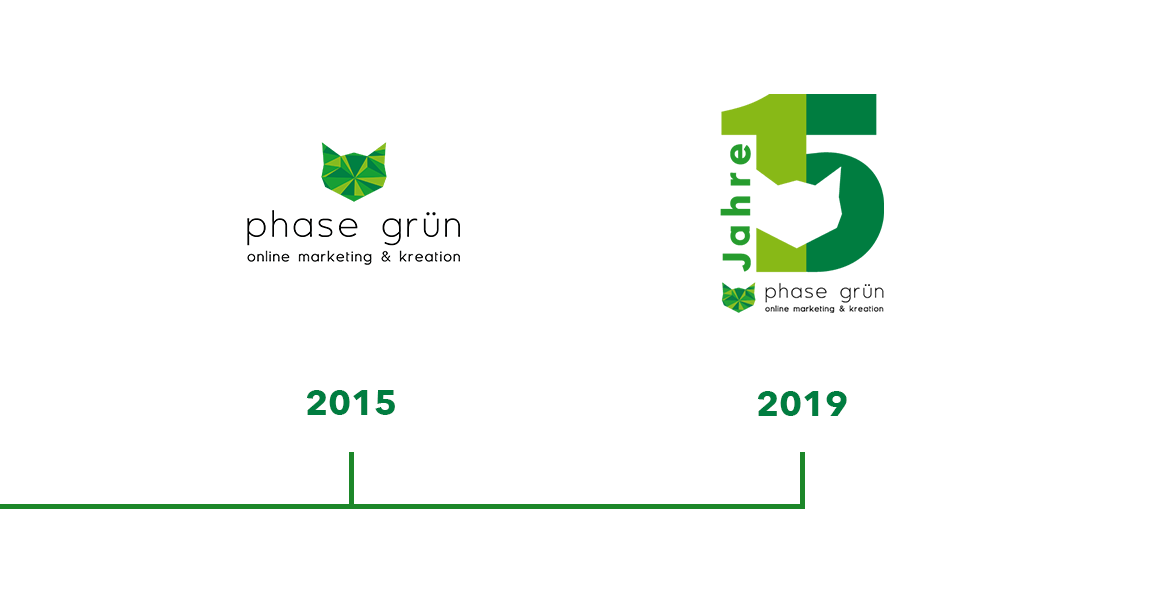
After various designs with the three shades of green – sometimes in a line, sometimes as a kind of cloverleaf and in many other variations – it After various designs with the three shades of green – sometimes in a line, sometimes as a kind of cloverleaf and in many other variations – it became increasingly clear that something different was needed. What could be more obvious than a cat’s head? Since our agency cat is already an idea generator, it was a perfect solution – emotional and connected to the agency. After countless sketches, our new phase grün logo was created in a 3D look. And we have proved in many ways over the past five years that this icon has what it takes.
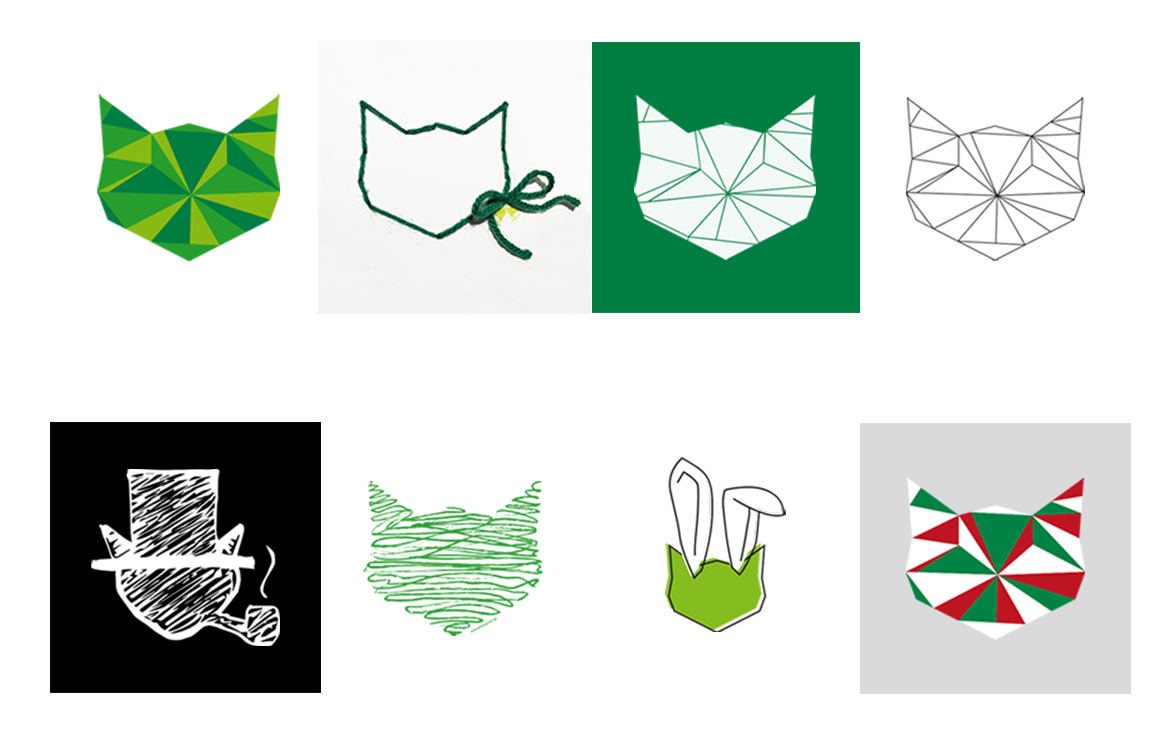
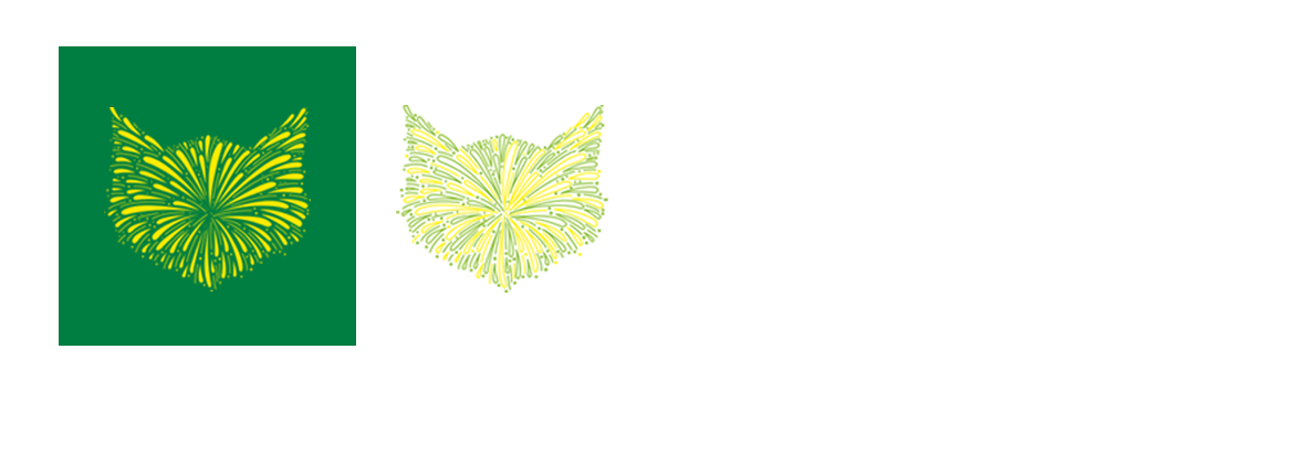
Image:
phase grün – all graphics
